Mobile Preview is a quick and easy way to test your responsive website. This tool will help you deliver great mobile experience to you costomers.
Quickly preview your responsive website designs at the dimensions they will be seen on popular mobile devices.
Includes presets for iOS (iPhone, iPad, Samsung Galaxy).
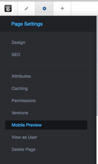
From Page Settings, Mobile Preview
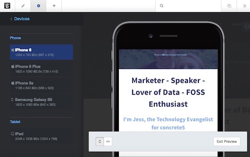
- Devices section shows all the mobile devices that can be viewed on the page. Click on a phone size to see the different mobile devices
- The Tablet section lets you choose to view it how it would be viewed on an iPad.
- You can use the rotate screen button to view the horizontal view
- Exit Preview will bring you back to the page settings